
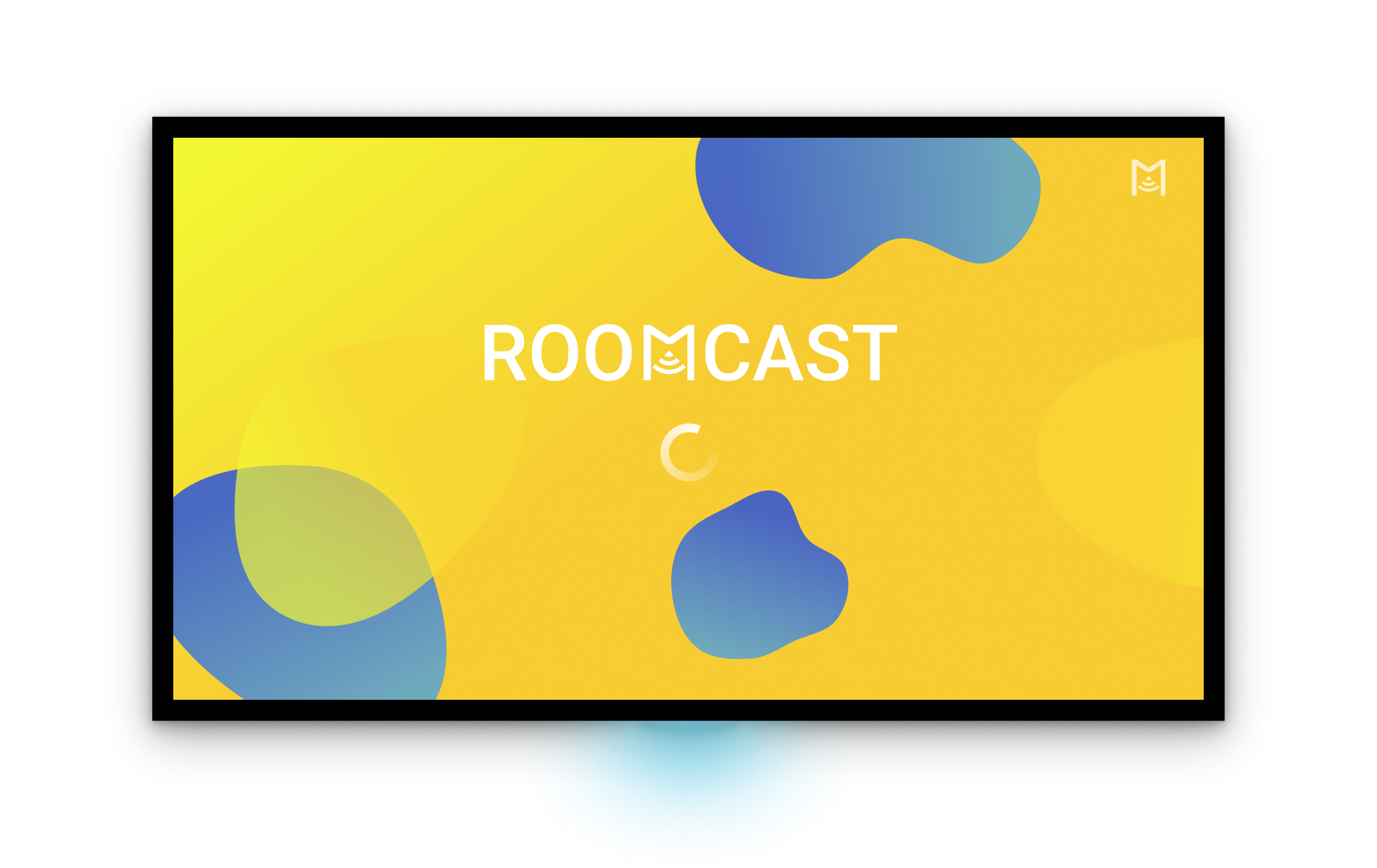
Roomcast
Cultivating familiar patterns for Smart TV podcast apps.
Role
UX Designer
UX Researcher
Product Designer
The team
Solo passion project
Timeline
Sept 2021 – Dec 2021
The challenge
For longer format podcasts, users dislike using headphones at home
Listeners are using their living room TVs to stream content and more. There are accepted and standardised models for video streaming on Smart TVs. But the current market in the app store do not provide an immersive listening experience.
The idea
Design a TV podcast app that reflects strong useability principles and works as a benchmark for the podcast listeners. I want the app to help users complete their listening goals, feel intuitive and anticipate their needs.
THe solution
Anticipating for listeners is the key

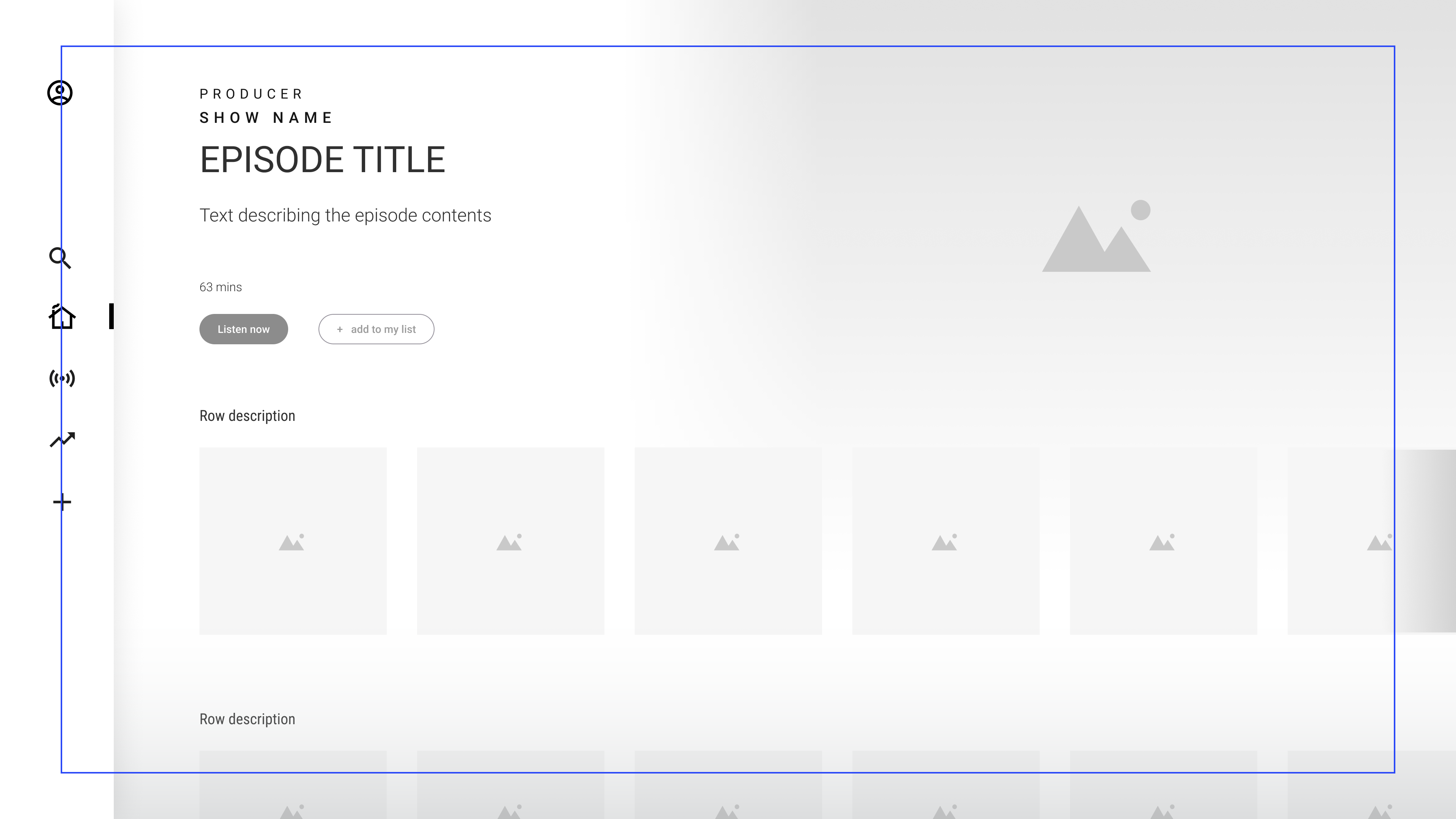
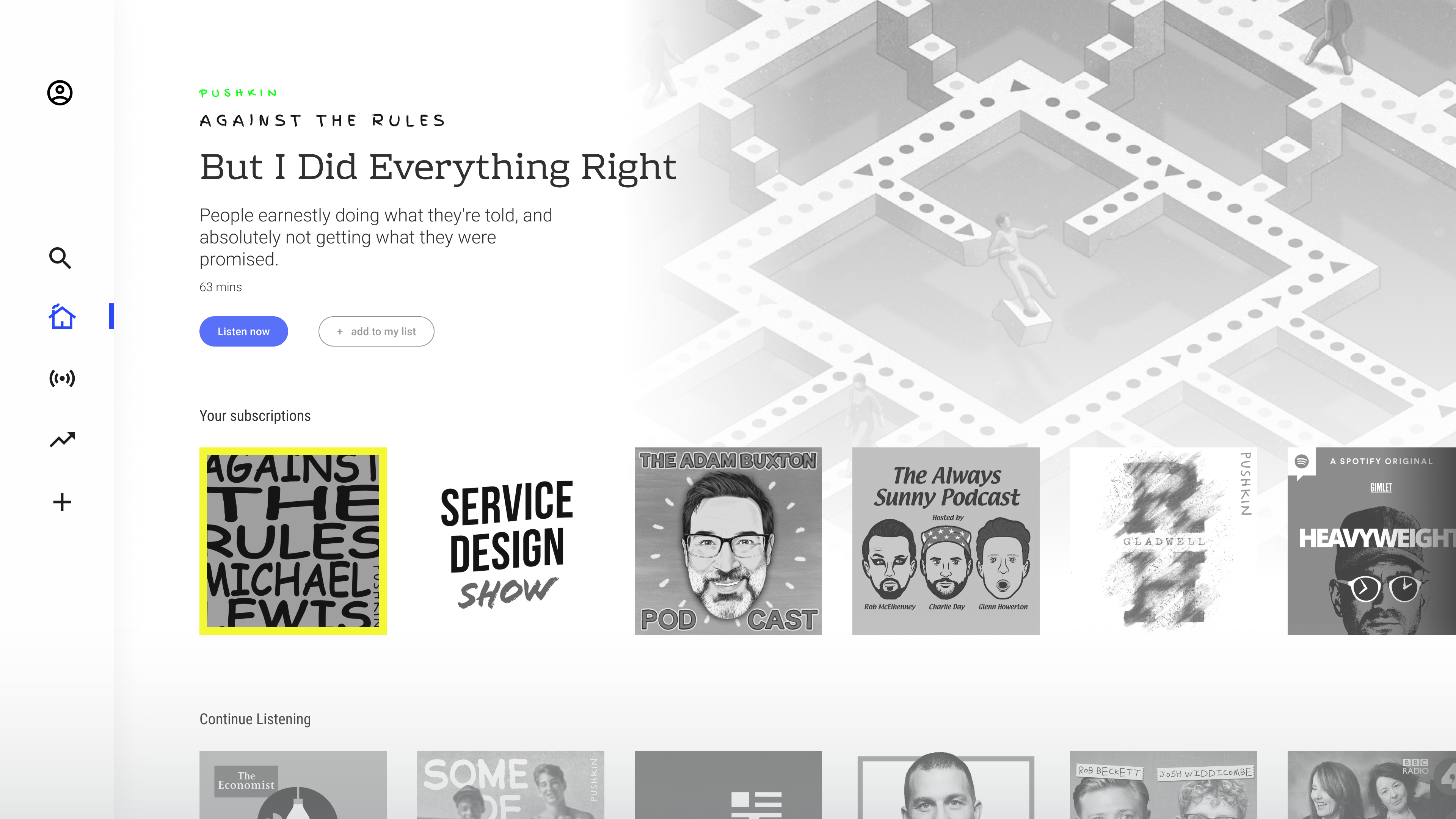
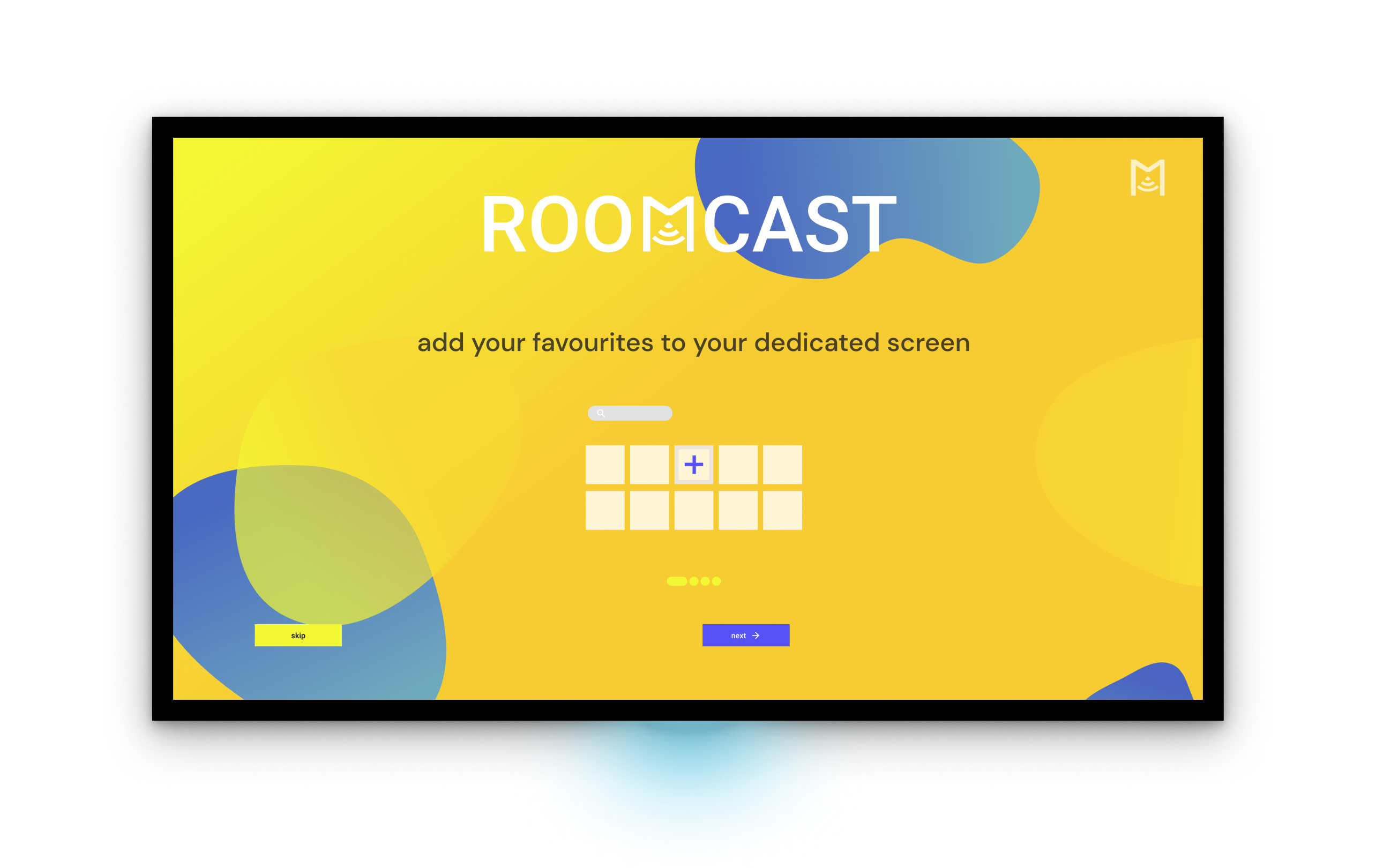
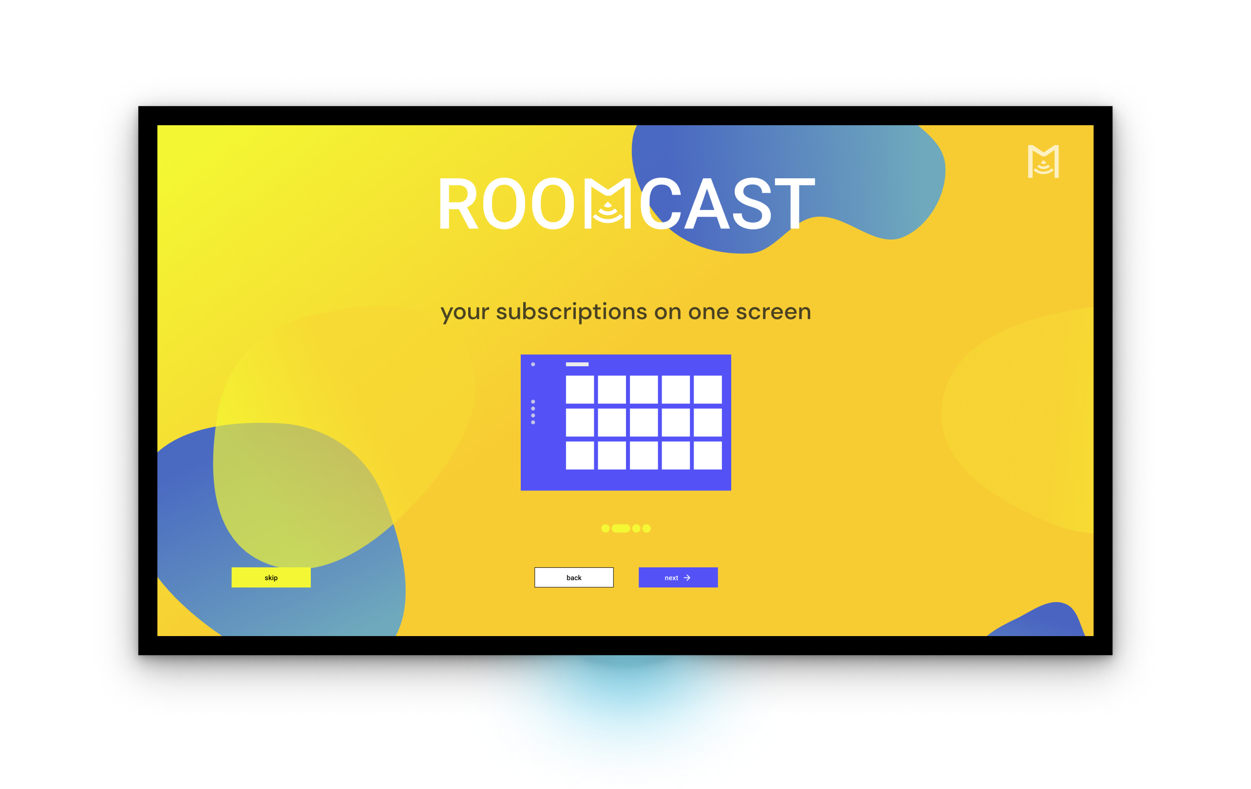
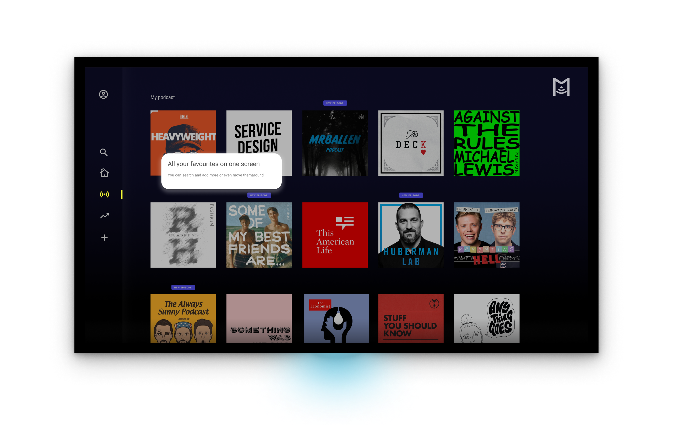
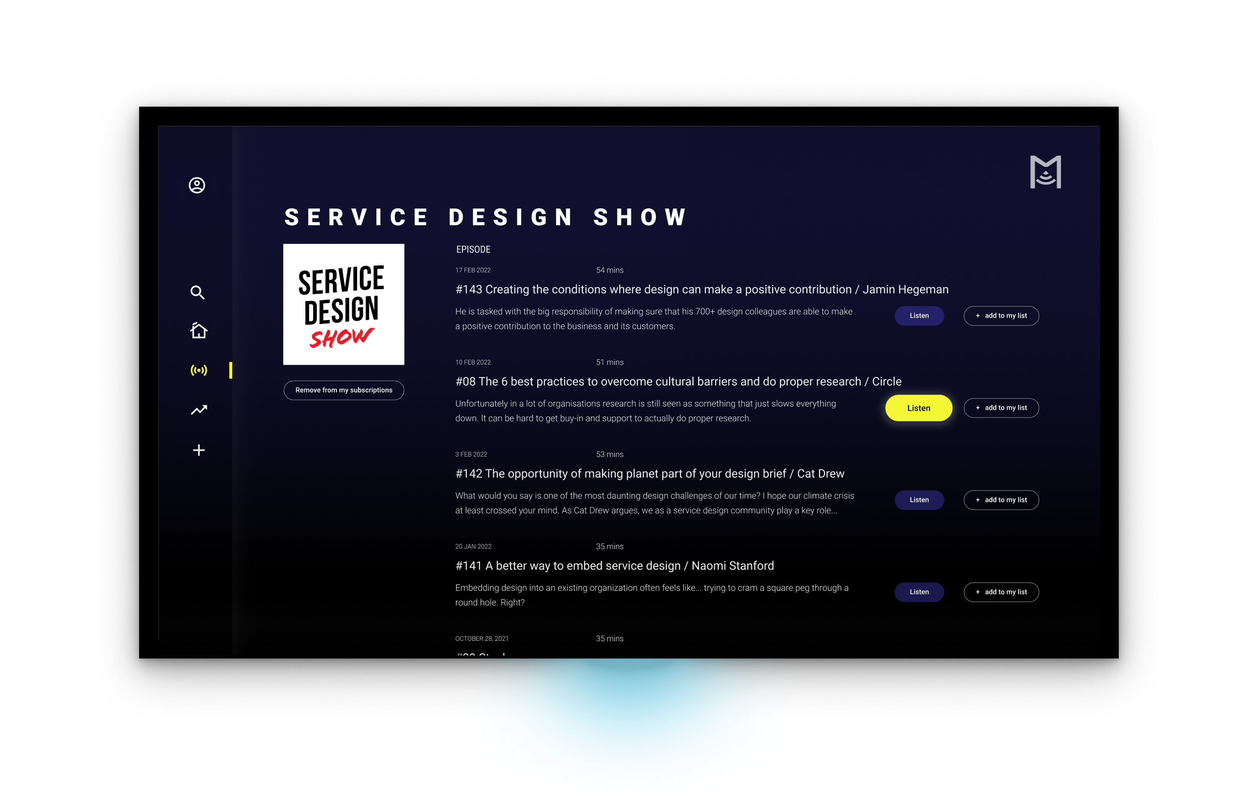
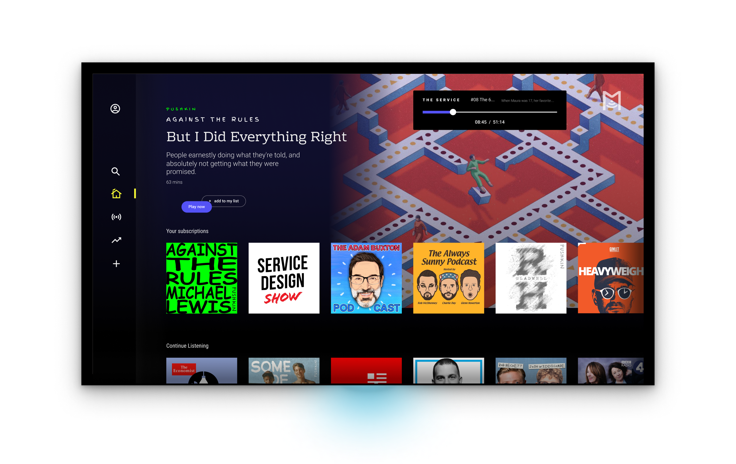
Your favourites all on one screen
- Get to your favourite show first
- A dedicated space to easily find your show
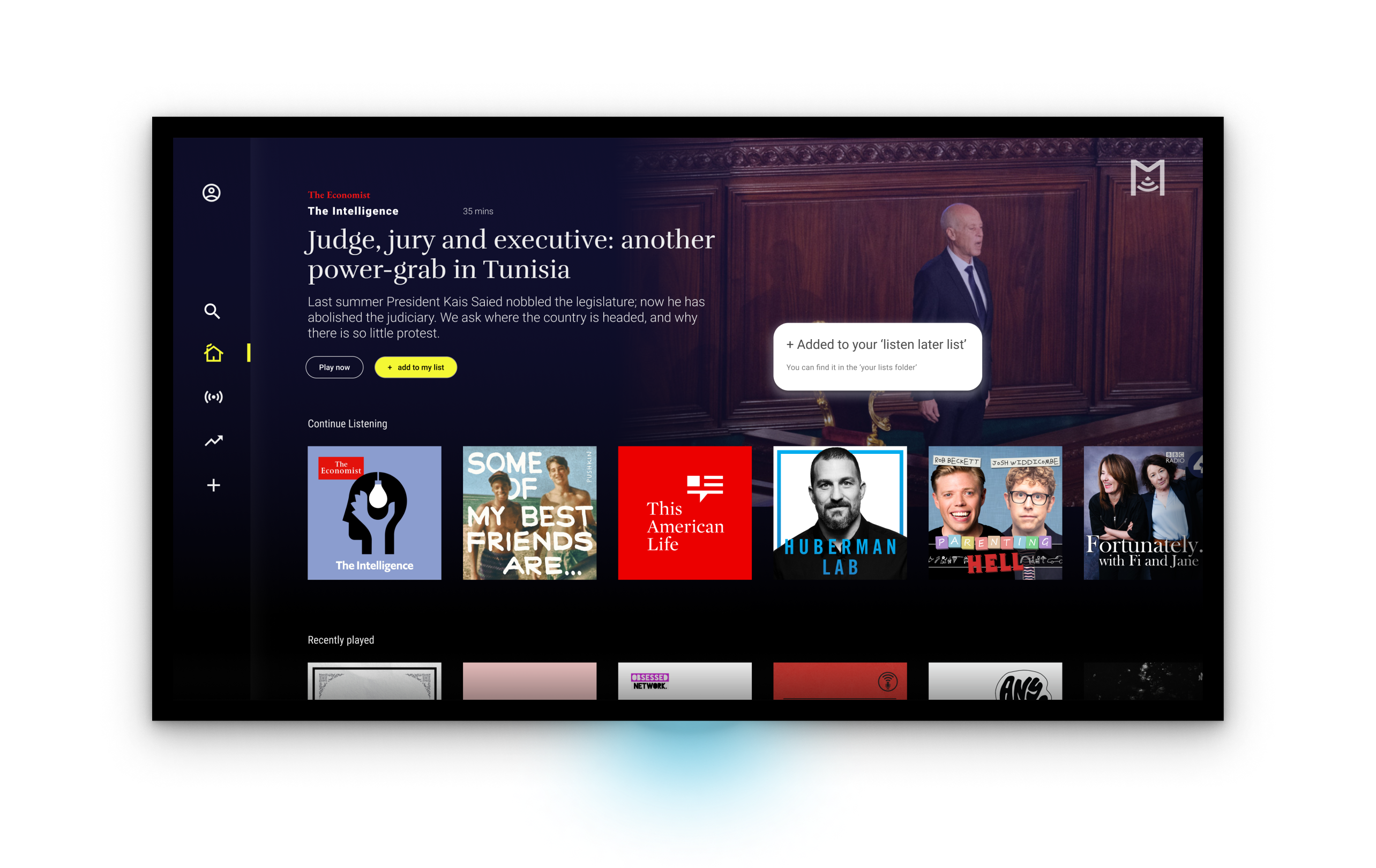
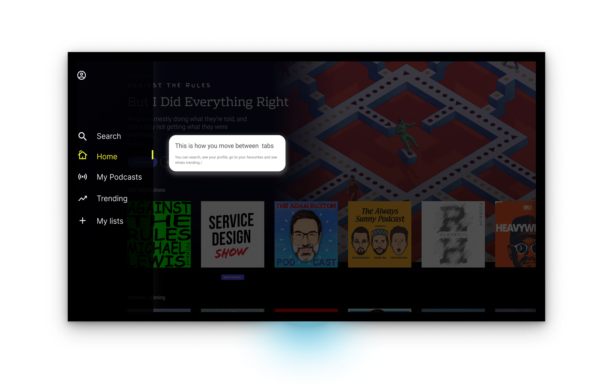
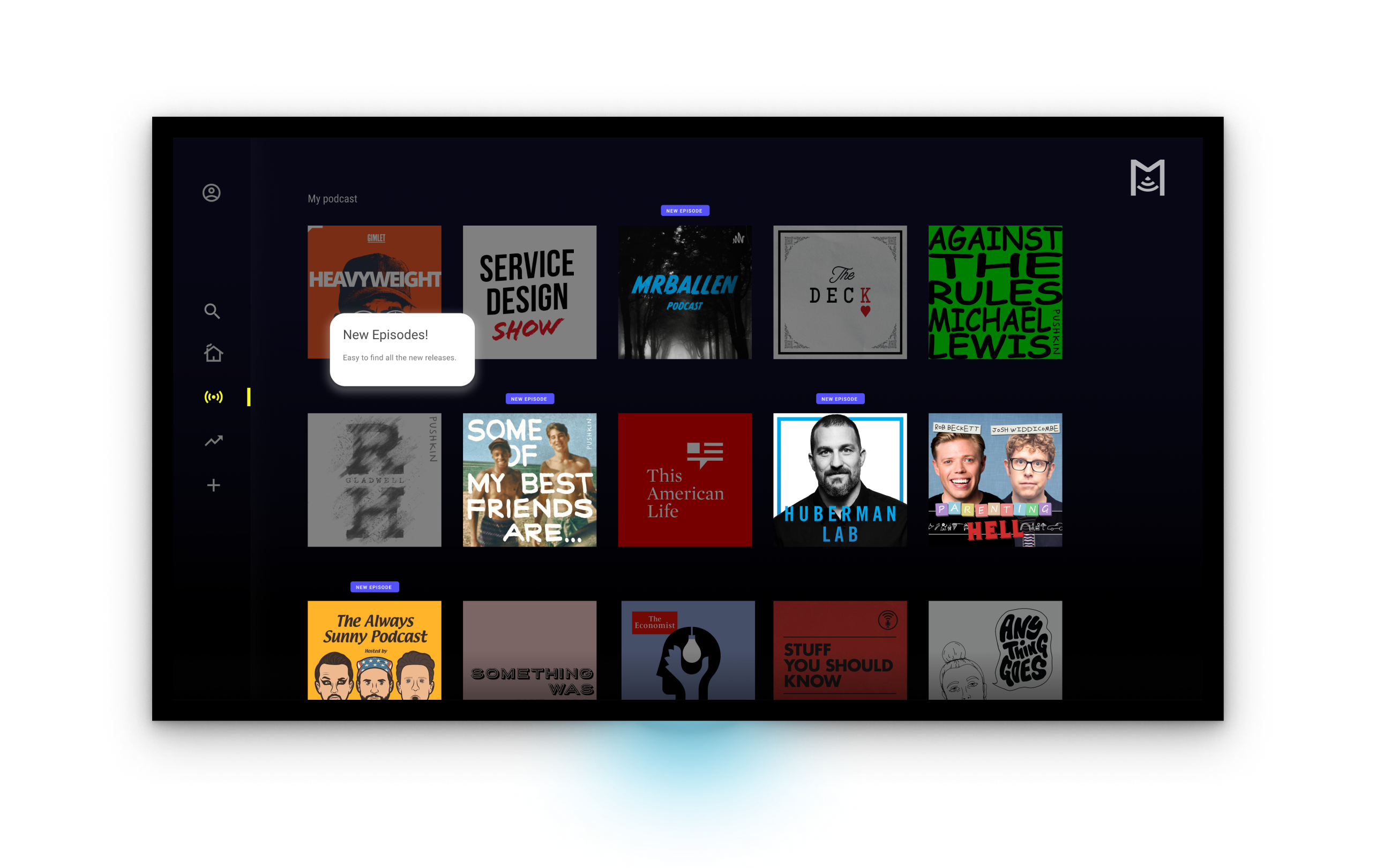
Dialogue boxes
- No need to guess navigational choices with onboarding
- Dialogue boxes and prompts explain features and actions
")

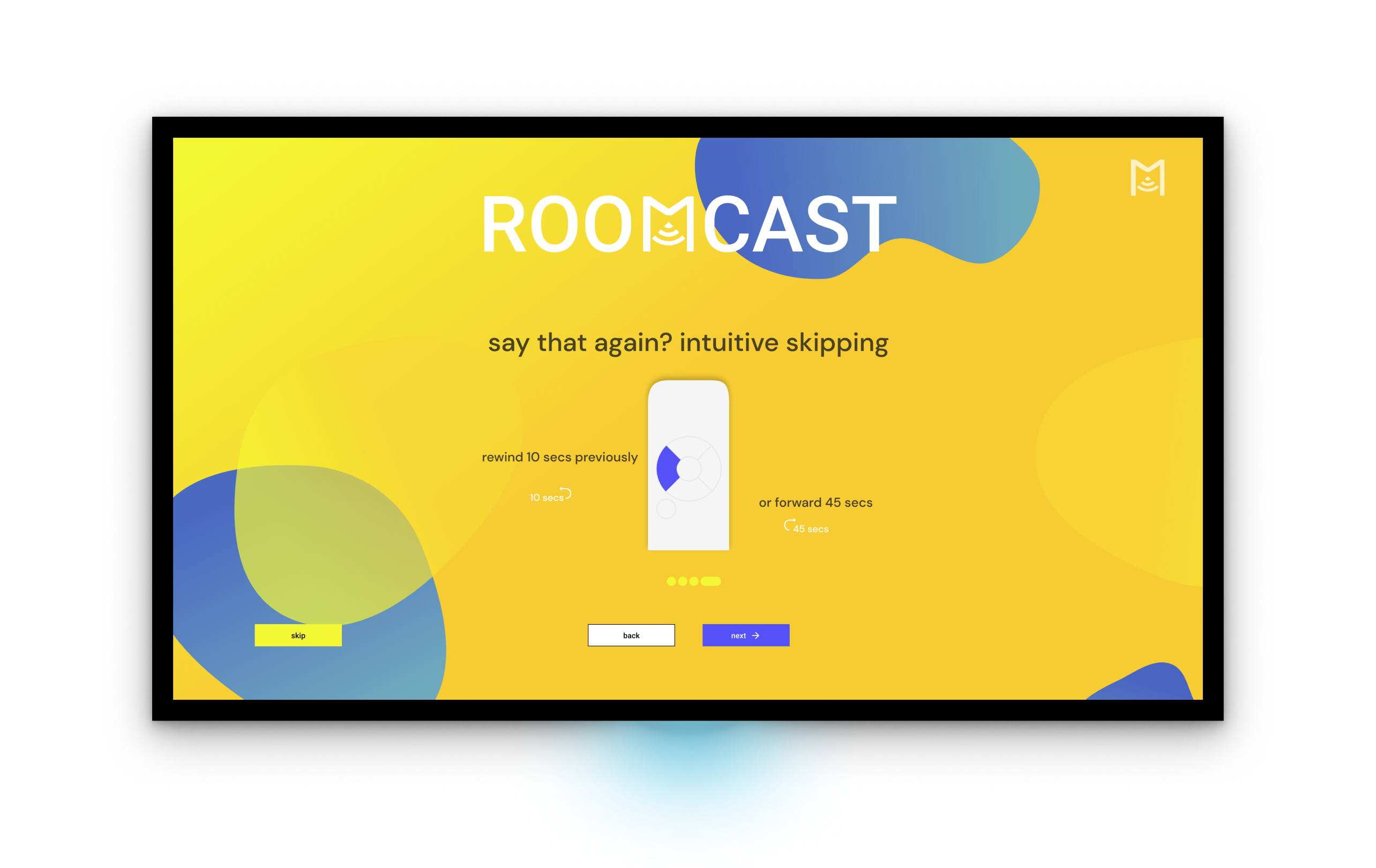
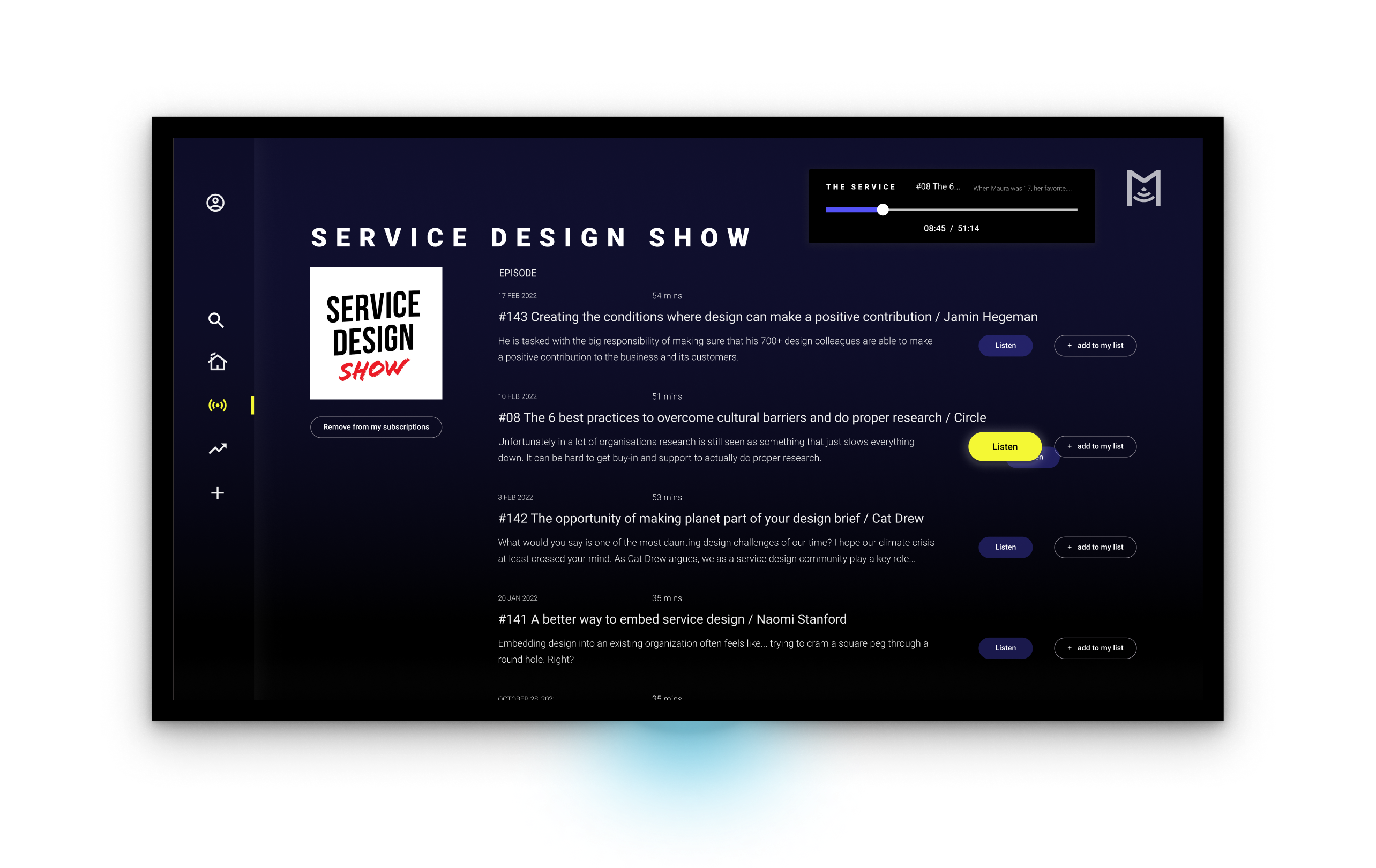
Podcast player that is easy to read
- Cooking or working? See where you are in an episode at a glance.
- Layout and contrast choices make it simple to see what you need
EXploring THE PROBLEM
UNDERSTAND
Smart TVs
The Smart TV and the content streaming landscape have changed our lifestyle to the extent that we regard Netflix as the standard when watching content.
What about listening to podcasts?
Sitting on the sofa
I’d like to focus on users who listen to podcasts at home.
As a UX Designer, I’d like to take a dip into the listening experience in my own home and get an initial feel in that role.
I managed to find and download a podcast app to my Smart TV. It required a short passage of concentration, signing up, repeatedly pressing the wrong button, some learning and then listening.
Let’s see what users are saying.

RESEARCH
Reviews of TV podcast apps
I wanted to read some comments on the Android market place to get some firsthand feedback on audio TV apps. This was the easiest decision to make and it didn’t take long to identify some issues.
The user interface is far too busy, with functions that aren’t useful for someone on the go.
Findings
- Lack of podcast features – The App is primarily built for music and then podcasts.
- Too busy – There is an abundance of information and the choices presented are difficult to comprehend.
- Performance – Due to the variety of manufacturers and specifications, the performance varied significantly.
User Interviews
After completing an Ixdf course on User Research – Methods and Best Practices, I decided that conducting a series of user interviews would be my first step in understanding users and the podcast listening environment in which they live. I interviewed five podcast listeners to learn about their motivations, feelings, and habits.
")
Questions included
How do you listen to podcasts?
Tell me about your last listening experience
Do you have any experience with Spotify?
Can you tell me about your home audio setup?
What Smart TV apps do you use?
Tell me about a positive experience with a Smart TV app
ANALYSIS
Lets group our info
I used an affinity map to organise all of my data and quotes and tried to find similar trends. Eventually, 9 major insights and 3 major themes emerged.

5 listeners
80 data points
9 insights
5 listeners
3 main themes
THE MAIN INSIGHTs
They desire to be free of their mobile devices and headphones, but a lack of high-quality immersive listening options posed a barrier.
Theme 1: Dedicated listeners
Every week, listeners tuned in to 3-5 of their favourite podcasts.
Podcast listeners arranged their listening into whatever spare time they had.
Regardless of their mood, listeners could always find something to their liking.
Theme 2: Performance
Although they recognise the simplicity and fluidity of some mobile apps, they wished to be free of their mobile device.
Many listeners praised Netflix’s presentation of their content.
The market for smart TV apps was either extremely good or extremely poor.
Theme 3: Surroundings
The TV location varied for many users. Some had a TV in shared spaces whilst some were isolated.
Headsets/earphones felt uncomfortable after a period of time.
Few had invested in additional audio systems. Either a soundbar or a surround system.
HOW MIGHT WE…
Encourage a sense of immersion if audiences listened to podcasts on the TV?
It was time to start thinking about ways to improve the listening experience.
ideas and solutions
DESIGN CONCEPTS
Setbacks + a new direction for TV podcasts
At first, I spent 2 weeks attempting to solve the feeling of being away from the screen and feeling immersed? I played with three different directions: bone conduction audio, Virtual Reality glasses, and an TV app solution.
However upon thinking about each I realised through testing and talking to my users that additional tech was inaccessible, cumbersome and could not match the benefits of a TV app.
The TV App must be designed so that the tasks and flows are not obtrusive, so that the user is unaware that they are using it.
Contextual Inquiry
Migrated podcast apps had lost key features
To see the listening experience, I needed to immerse myself in the users’ space. A contextual inquiry would provide me with information about people’s processes, routines and reactions. It is comparable to an apprentice and master learning through observation and inquiring for clarity and understanding.

5 participants
Most had experience using Smart TVs
Spotify was preinstalled
Interviews and observations whilst using the app
ANALYSIS
Findings
- People are busy – participants want to spend as little time as possible on the app because they have other things to do. During playback, they frequently looked at the screen to see how much time had passed.
- Button presses are taken into account – participants worked hard on button pressing. Some felt more at ease taking the risk of pressing the wrong button.
- Navigating to content is different – participants’ content decisions were based on the ease with which they could find content, and because there was no gesture control, typing, for example, took longer.
Despite the variety of remote control devices, three buttons remained consistent: a directional pad, a back button, and a select button.
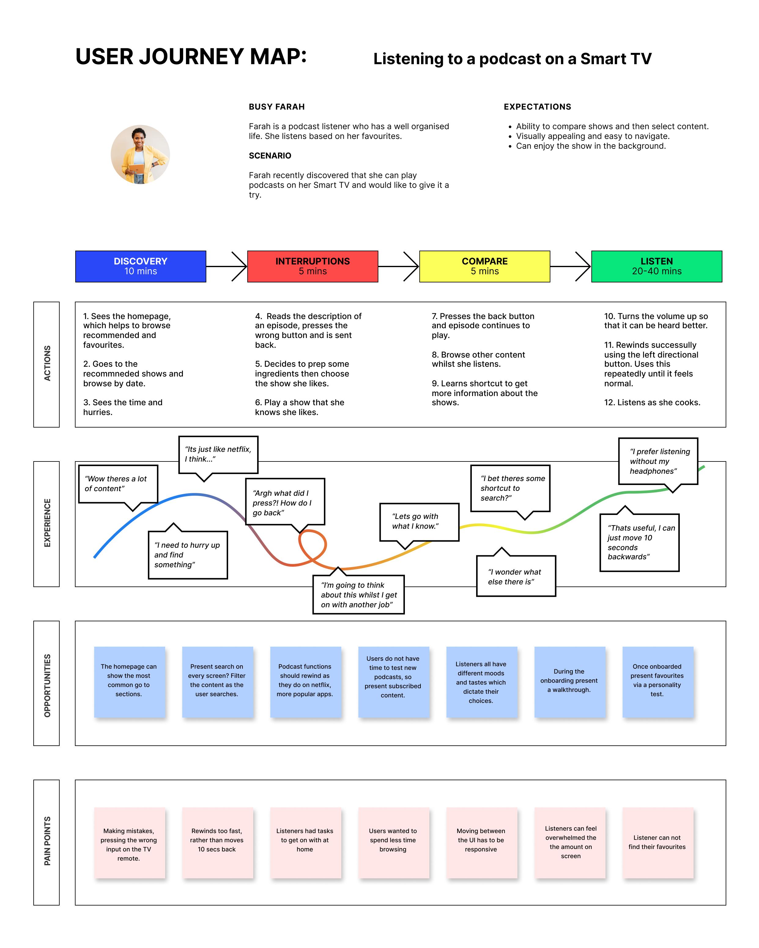
USER JOURNEY
Users are guessing
To visualise the information from the contextual inquiry I created a user journey map. It captures the flow, actions, thoughts, emotions and interruptions that occur while completing a task.
DESIGN
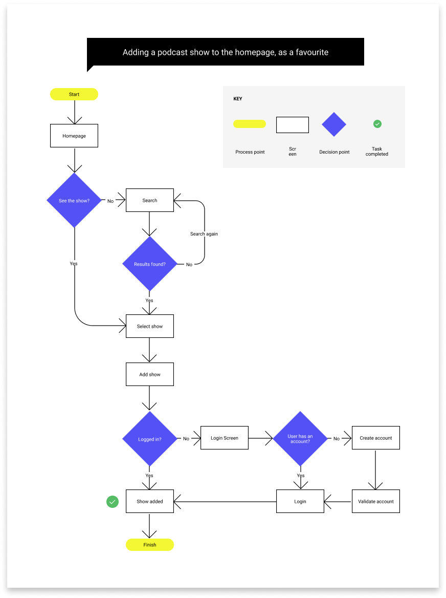
User tasks + user flows
From observing and speaking to users in their flow states, they gravitated to their favourite shows
I want to anticipate these cognitive patterns and design flows that enable these states.
deciding and prototyping
USER INTERFACE
Design Solutions and the UI possibilities
Present content so that it supports decision making
Global navigation bar with a 2 panel design pattern
Users can see the overall items and specific items to inform decison making.
A center stage with the most important information
Users focus on an area with the most frequently used items and have access to it.
Help listeners find their favourite podcasts
A search bar that finds particular item
Users save time looking for items from large amounts of information and see whats suggested.
Tags that group associated content
Users can click to find relevant information to that group and narrow down their choices.
AID navigational choices and decisions
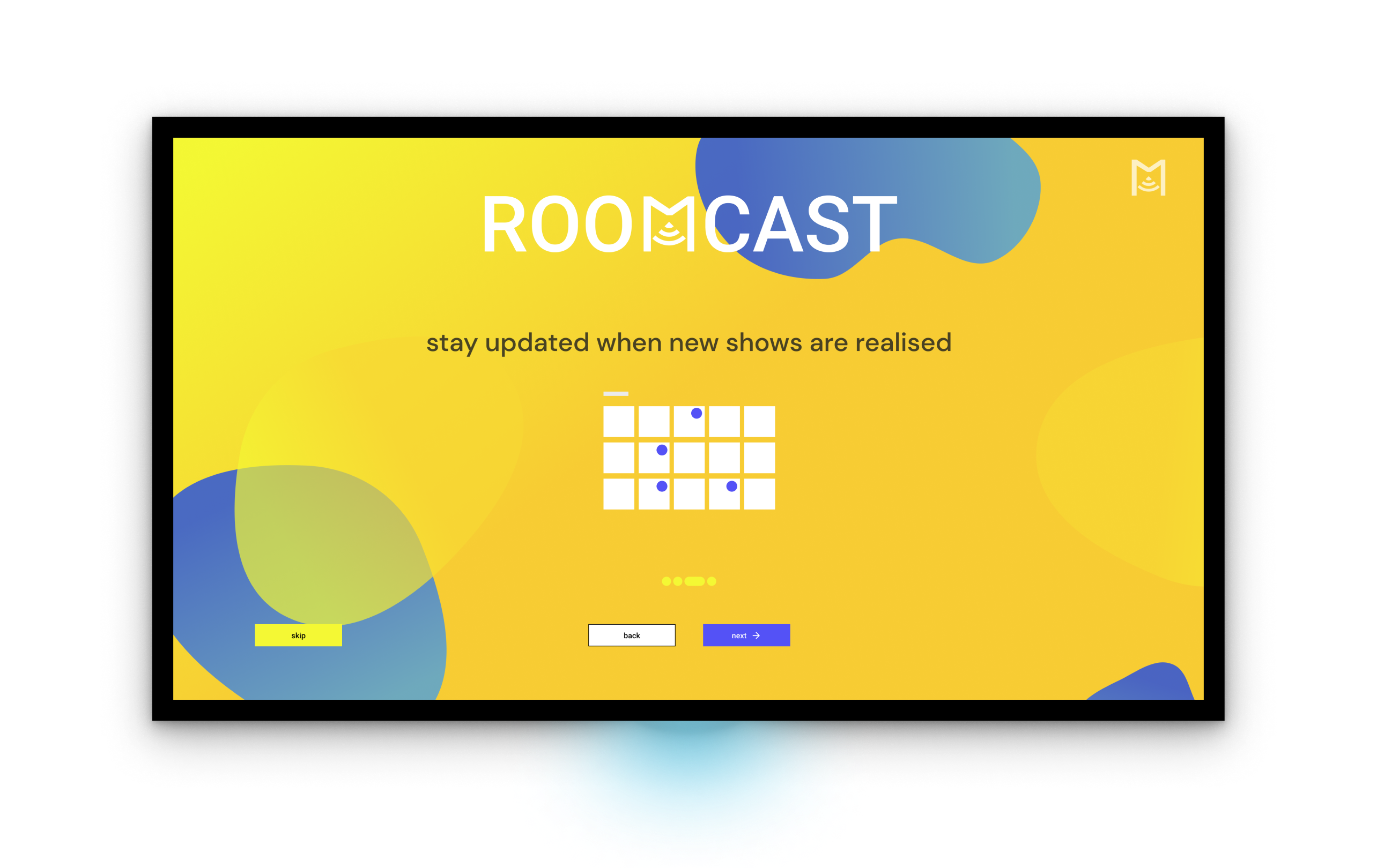
Dialogue boxes to prompt and advise users
Users are informed about critical information to help them know what is relevant
Onboarding to guide the user
Users are shown imagery and text that simplifies the products features and use
WIREFRAMES
Structure
It was important to adher to the correct parameters of the given device usage. Meaning I designed the UI for a screen resolution of 1920 x 1080 pixels (1080p, widescreen aspect ratio of 16:9 as per apples HCI guidelines).
I want to keep primary content away from the edges of the screen (60 pixels from the top and bottom of the screen, and 80 pixels from the sides) as it’s difficult to see content that close to the edges.
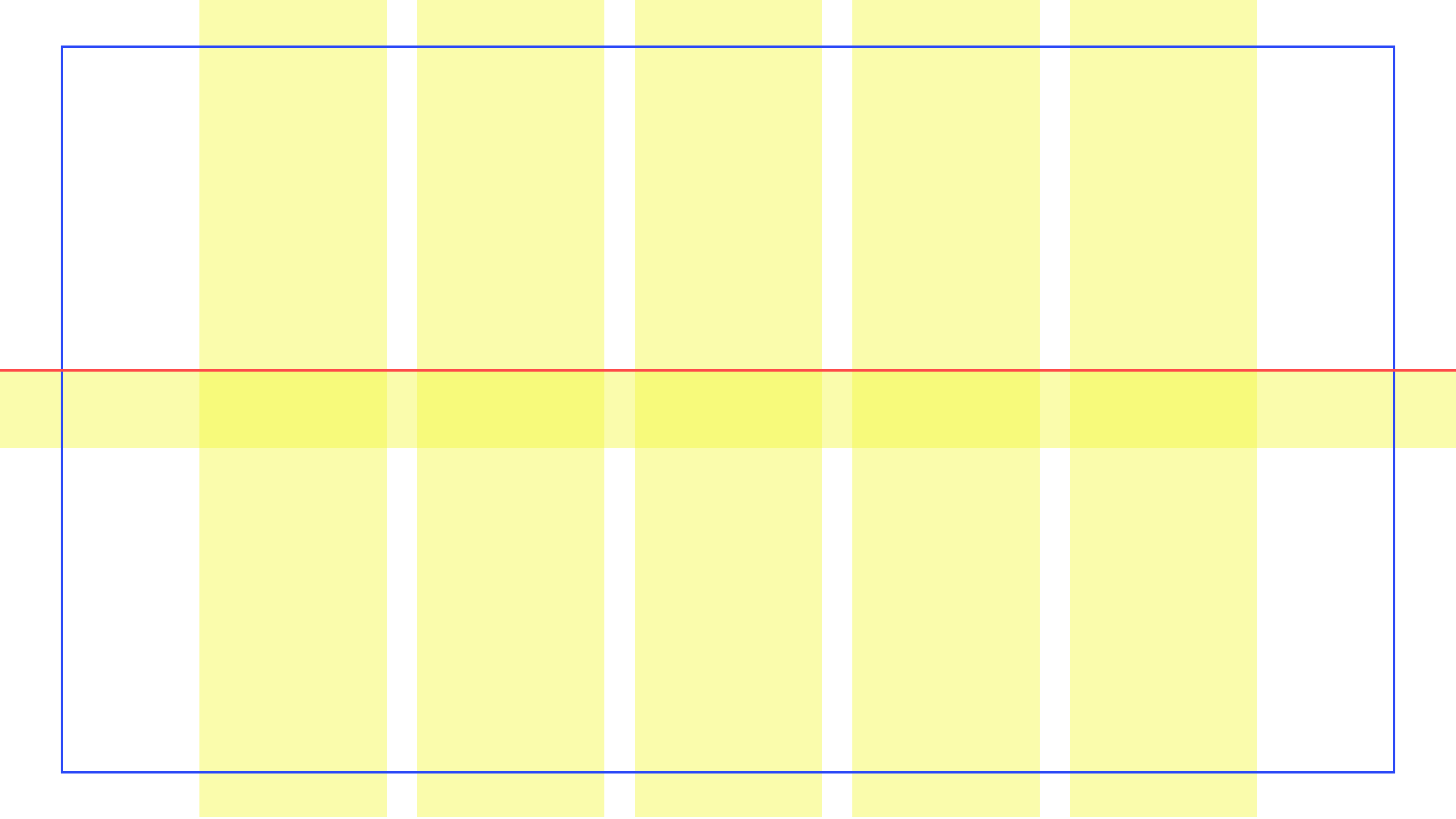
Default focus will be at the keyline (redline) as per Androidtv pattern guide.
5 x 250px centred columns with 40px gutters
5 columns of content provide enough information without overwhelming the user. With the use of a gradient, content on the periphery will appear within reach but slightly out of focus.
Make the focused item stand out. Users select and manipulate elements onscreen from a distance, it’s critical that they always know which item is in focus.
SEE HOW IT WORKS
TESTING + IMPROVEMENTS
3 major improvements in my design
Based on various feedback from 8 other peers and mentor feedback, I iterated my design over the span of 4 weeks- with 3 major improvements:
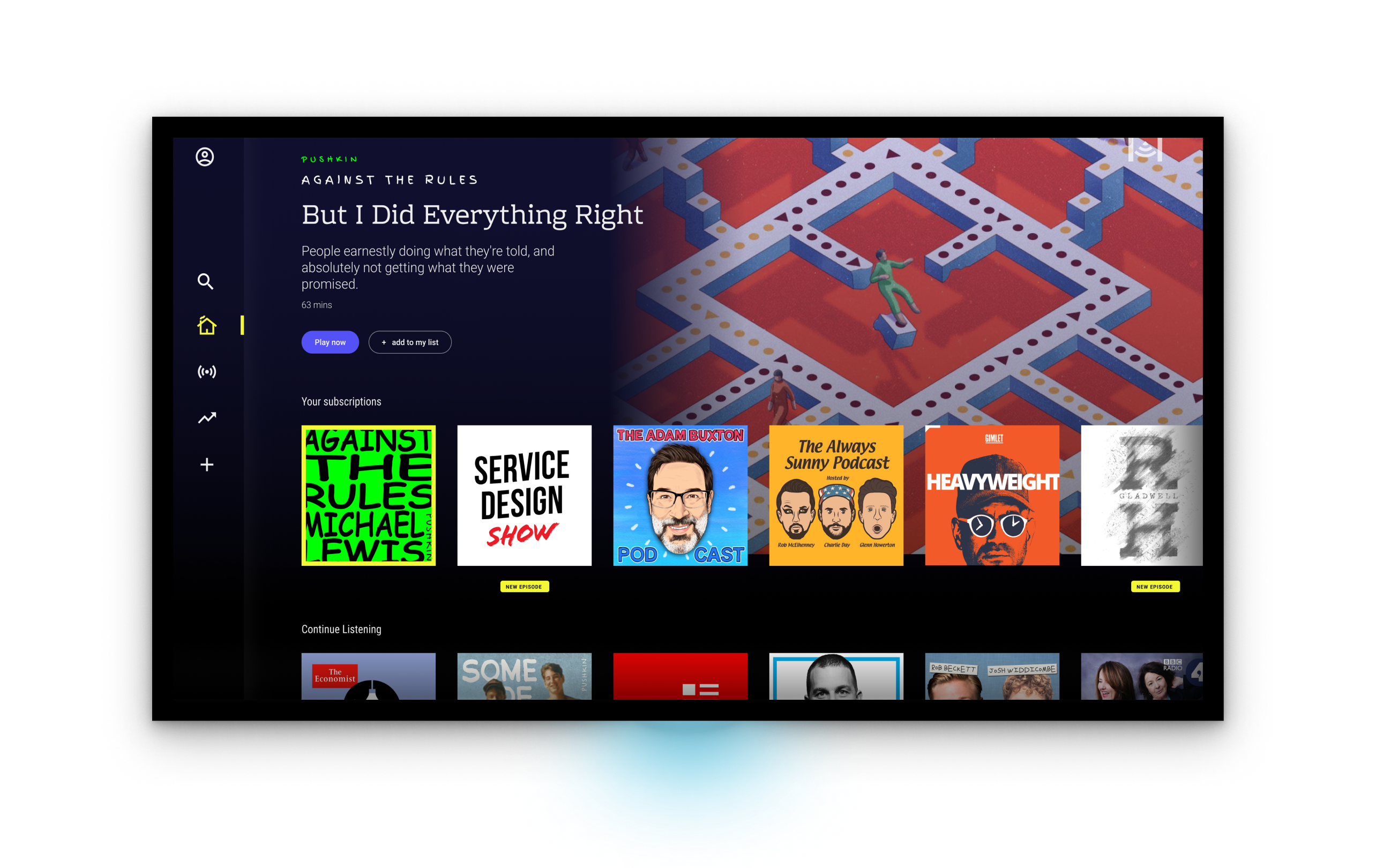
1. Removing the centre stage from my podcast tab
- Originally had a centre stage which displayed info about the most recent epsiode.
- Users preferred the ‘my podcasts’ tab to be a shortcut to every show they were subscribed to.
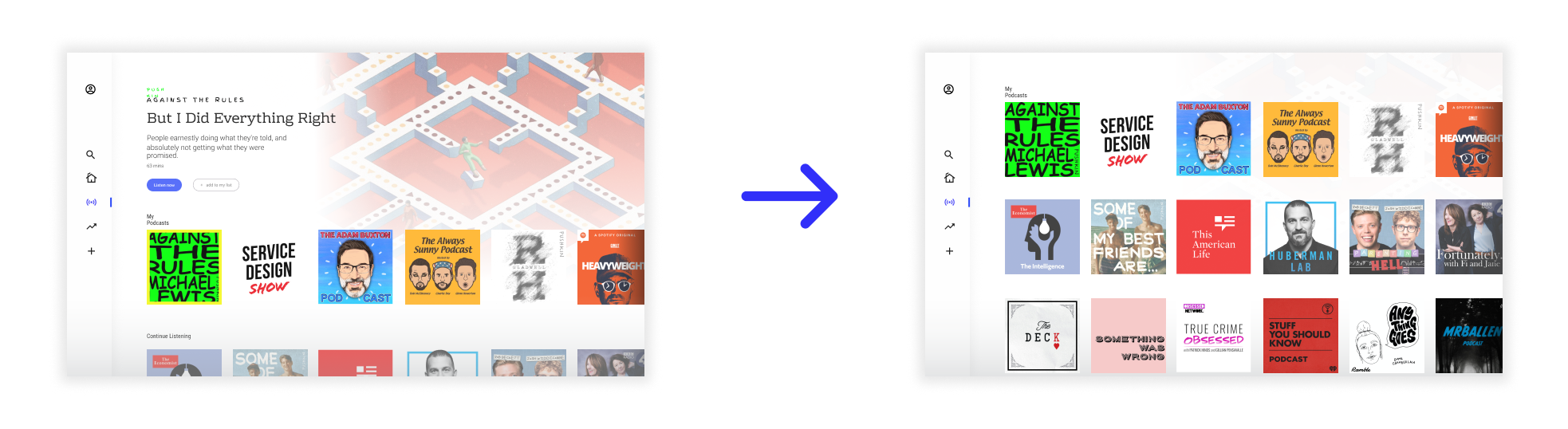
2. Concealing the navigation text
- Originally the navigation bar would display the icon and text.
- Users found that they felt closer to the content if they could see more of it.
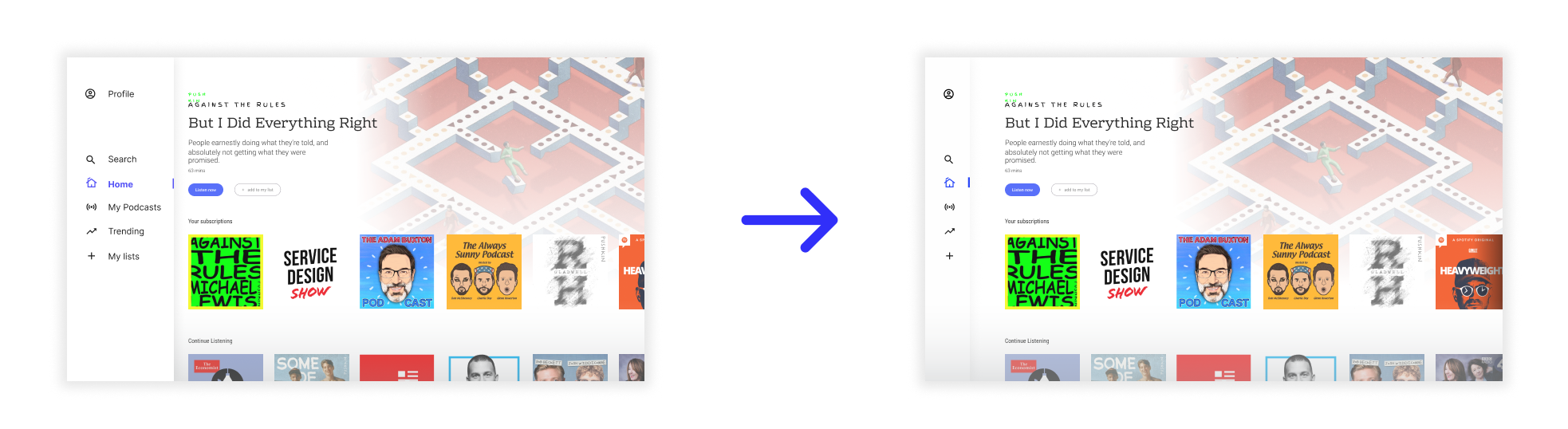
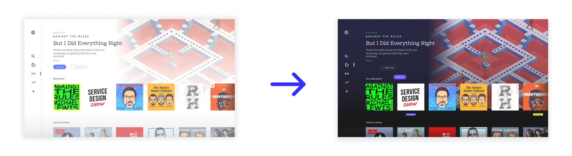
3. Changing the background to a darker tone
- Originally the colour palette was presented in lighter tones.
- With the move to a darker tone the glare of the screen was reduced.
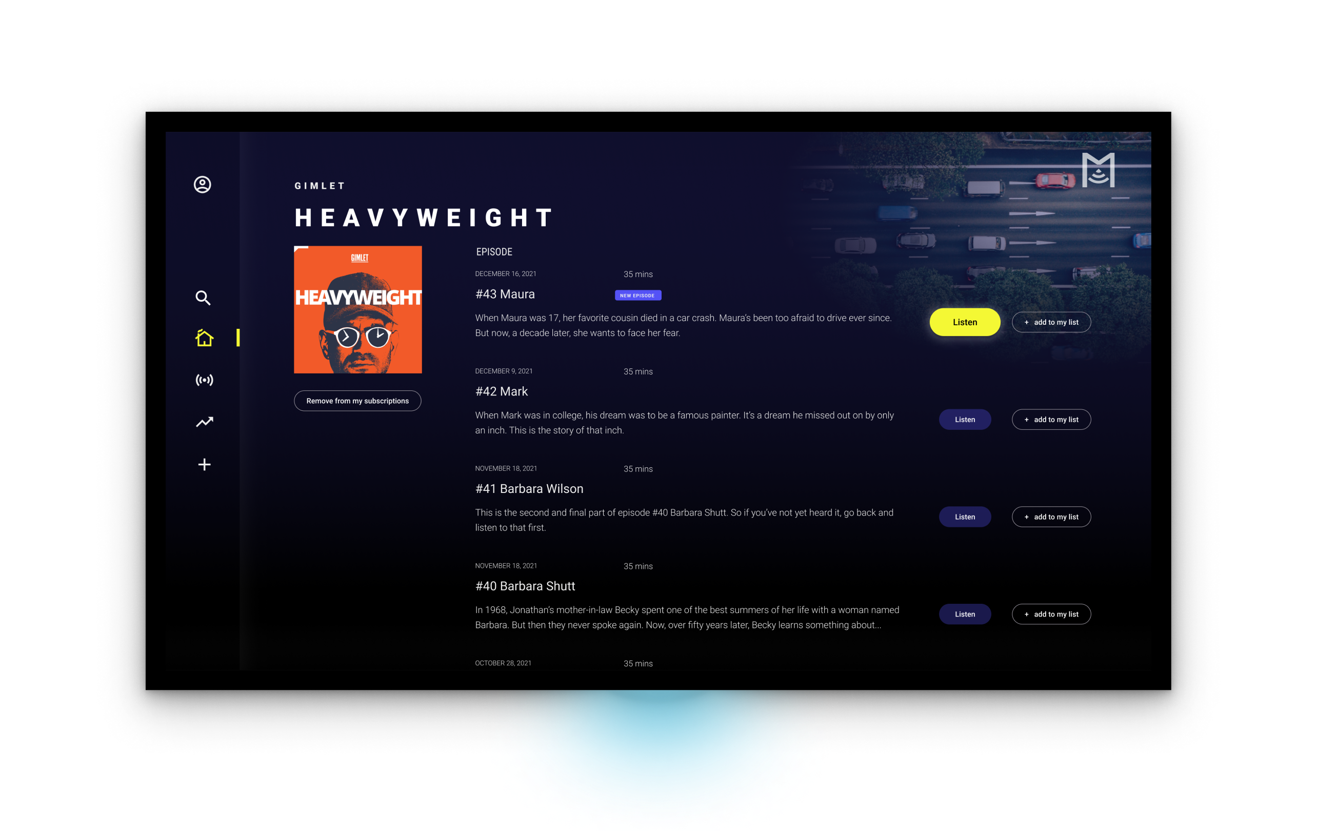
THE FINAL SCREENS
The Podcast App
")


Onboarding
Dialogues

Tasks
CONCLUSIONS + LESSONS LEARNING
What I’d do differently
This was my first UX project. This was a my first solo passion project to deliver on the User Research and UI learning.
- Iterate as much as you can, whilst its still inexpensive. The transition from low to high resolution prototyping was extremely fast, which meant that larger changes required more time tinkering.
- Failures serve as a springboard to the solution. I ran into a slew of roadblocks while attempting to grasp the design’s intent. This really grounds the design’s strength.
- Insight-based. Rather than learning about the process, the solutions came from learning more about the users. Knowing and understanding users’ wants and needs is everything, as Sarah Winters writes in Content Design.